Beyond Red and Green: How to Merchandise Bedding for the Holidays
Table of Contents
As the holiday season approaches, you may be planning showroom displays or helping clients refresh their bedrooms. But creating a seasonal feel doesn’t have to mean red and green, Christmas prints, or festive decorations. The bedding itself can set the mood. When selecting luxury bedding for retailers, warm neutrals, rich colors, and a thoughtful mix of fabrics can help create an inviting display. In this blog, we’ll explore how retailers and designers can use thoughtful bedding combinations to create inviting holiday displays and client spaces that feel relevant well beyond December.
Rethink the Holiday Color Palette
Color sets the mood before you add a single accessory. When planning holiday displays or client bedrooms, start with a few related shades, then use fabric and texture to bring them together. These three combinations offer a fresh approach to seasonal bedding. For each display or client proposal, assign three roles: a main shade, a supporting color, and a smaller accent. As a starting point, aim for roughly 60%, 30%, and 10% of the visible arrangement. This gives customers a clear combination they can recreate.
Winter Elegance
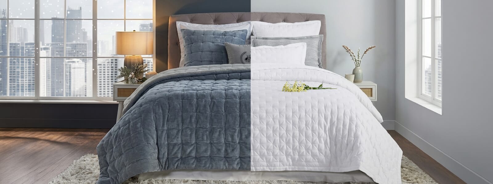
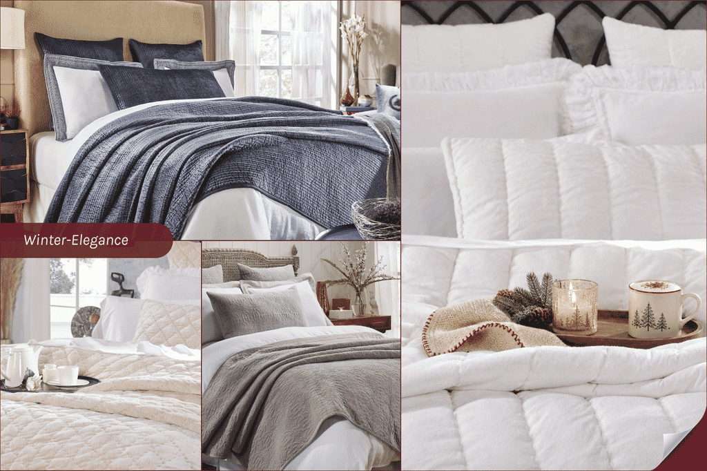
For a winter display, choose a clear contrast between deeper shades and pale neutrals. Navy with silver and white creates a cooler scheme, while champagne with ivory and graphite offers a warmer alternative.
The Spencer Channel Stitch Velvet Coverlet in Navy illustrates the first direction; the Clermont Diamond Velvet Quilt in Champagne provides a starting point for the second. Let the main color cover the largest area, use the supporting shade to balance it, and reserve the accent for smaller details. For retailers, present these as separate options so shoppers can compare a darker look with a lighter one. For designers, consider the headboard, walls, and natural light before deciding which shade should dominate. Compare fabric samples under the room’s lighting, since sheen and texture affect how colors appear. Keep a labeled sample grouping beside the display to make the selected combination easy to identify.
Winter Elegance
For a winter display, choose a clear contrast between deeper shades and pale neutrals. Navy with silver and white creates a cooler scheme, while champagne with ivory and graphite offers a warmer alternative.
The Spencer Channel Stitch Velvet Coverlet in Navy illustrates the first direction; the Clermont Diamond Velvet Quilt in Champagne provides a starting point for the second. Let the main color cover the largest area, use the supporting shade to balance it, and reserve the accent for smaller details. For retailers, present these as separate options so shoppers can compare a darker look with a lighter one. For designers, consider the headboard, walls, and natural light before deciding which shade should dominate. Compare fabric samples under the room’s lighting, since sheen and texture affect how colors appear. Keep a labeled sample grouping beside the display to make the selected combination easy to identify.
Earthy Richness
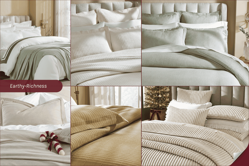
Warm neutrals and natural greens create an inviting direction for Thanksgiving bedding. Try olive with dune and off-white, or wheat with ivory and taupe. The Dream Organic Cotton Duvet Cover in Olive gives the first combination its main color, while the Portico Cotton Quilted Coverlet in Wheat suggests a warmer alternative.
Choose one direction for each display, keeping the supporting shade quieter and the accent smaller. For retailers, show how these colors can work with neutral bedding customers already own, making the recommendation relevant to a seasonal refresh. For designers, compare olive or wheat with existing wood finishes and upholstery before selecting the remaining shades. If the main color and furniture are similar in depth, use a lighter supporting shade to separate them visually. Present the final combination with labeled swatches, giving shoppers and clients a clear reference when selecting complementary pieces for their bedrooms.
Earthy Richness
Warm neutrals and natural greens create an inviting direction for Thanksgiving bedding. Try olive with dune and off-white, or wheat with ivory and taupe. The Dream Organic Cotton Duvet Cover in Olive gives the first combination its main color, while the Portico Cotton Quilted Coverlet in Wheat suggests a warmer alternative.
Choose one direction for each display, keeping the supporting shade quieter and the accent smaller. For retailers, show how these colors can work with neutral bedding customers already own, making the recommendation relevant to a seasonal refresh. For designers, compare olive or wheat with existing wood finishes and upholstery before selecting the remaining shades. If the main color and furniture are similar in depth, use a lighter supporting shade to separate them visually. Present the final combination with labeled swatches, giving shoppers and clients a clear reference when selecting complementary pieces for their bedrooms.
Festive Flair
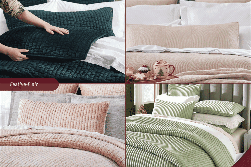
Festive color can come from deep greens, soft pinks, or a brighter accent without relying on Christmas prints. Rose, lavender, magenta, rouge, gold, and brighter shades bring a more expressive holiday feel. Treat them as separate color directions, giving each room to stand out.
Try forest green with ivory and gold, rose with champagne and white, or aloe with off-white and a warm neutral. The Walton Channel Velvet Quilt in Forest Green offers a strong focal color, while its Rose option creates a softer alternative. The Milton Channel Stitched Velvet Coverlet in Aloe gives customers a lighter green direction.
For retailers, keep each scheme distinct and show one alternative accent beside the finished display. This lets shoppers explore another option without sorting through several competing colors. For designers, ask whether clients want the chosen shade across the bed or only in Shams and Decorative Pillows. Keep the remaining colors restrained so the focal shade stays clear.
Festive Flair
Festive color can come from deep greens, soft pinks, or a brighter accent without relying on Christmas prints. Rose, lavender, magenta, rouge, gold, and brighter shades bring a more expressive holiday feel. Treat them as separate color directions, giving each room to stand out.
Try forest green with ivory and gold, rose with champagne and white, or aloe with off-white and a warm neutral. The Walton Channel Velvet Quilt in Forest Green offers a strong focal color, while its Rose option creates a softer alternative. The Milton Channel Stitched Velvet Coverlet in Aloe gives customers a lighter green direction.
For retailers, keep each scheme distinct and show one alternative accent beside the finished display. This lets shoppers explore another option without sorting through several competing colors. For designers, ask whether clients want the chosen shade across the bed or only in Shams and Decorative Pillows. Keep the remaining colors restrained so the focal shade stays clear.
Mix Fabrics, Textures, and Patterns
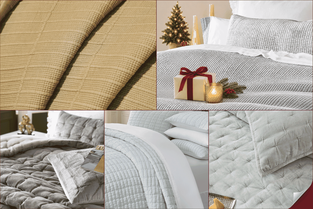
Even a simple palette feels richer when you mix textures. Contrast smooth Sheets with structured quilting, then introduce a softer texture to balance the arrangement. Smooth cotton sateen provides a soft sheen, while quilting adds depth and definition. Details such as Portico’s quilting or Sophie’s hand pinching show how subtle surface patterns can bring interest to a tonal display. Velvet introduces a plush finish alongside crisp cotton. Used across a folded Coverlet or coordinating Shams, it adds winter warmth without needing bold colors. The Spencer and Milton coverlets offer this contrast through their velvet textures and stitched details. For a more relaxed look, combine linen with woven cotton Blankets.
Fold back Quilts and Coverlets, leave Sheets visible, and keep fabric samples within reach. This lets shoppers and clients see how the layers work together and feel the differences for themselves.
Mix Fabrics, Textures, and Patterns
Even a simple palette feels richer when you mix textures. Contrast smooth Sheets with structured quilting, then introduce a softer texture to balance the arrangement. Smooth cotton sateen provides a soft sheen, while quilting adds depth and definition. Details such as Portico’s quilting or Sophie’s hand pinching show how subtle surface patterns can bring interest to a tonal display. Velvet introduces a plush finish alongside crisp cotton. Used across a folded Coverlet or coordinating Shams, it adds winter warmth without needing bold colors. The Spencer and Milton coverlets offer this contrast through their velvet textures and stitched details. For a more relaxed look, combine linen with woven cotton Blankets.
Fold back Quilts and Coverlets, leave Sheets visible, and keep fabric samples within reach. This lets shoppers and clients see how the layers work together and feel the differences for themselves.
Build a Complete Bedding Look
A finished bed helps shoppers picture how individual pieces work together. Rather than displaying each category separately, bring complementary products together in one arrangement. For a holiday season bedding display, start with Sheets, choose a Duvet Cover or Quilt as the main piece, then add a Coverlet or Blanket and coordinating Shams. Connect the selection through a shared color or detail.
For retailers, carry this approach beyond the display bed. Group related products nearby, with clear labels showing names, sizes, colors, prices, and what each purchase includes. Make it easy for shoppers to find the pieces they see and explore additional layers.
Offer two options: a simple pairing for a small refresh and a fuller selection for a complete bedroom update. Give each addition a purpose, such as an extra Blanket for guests or Shams that complement an existing Coverlet.
Arrange Displays for Easy Browsing
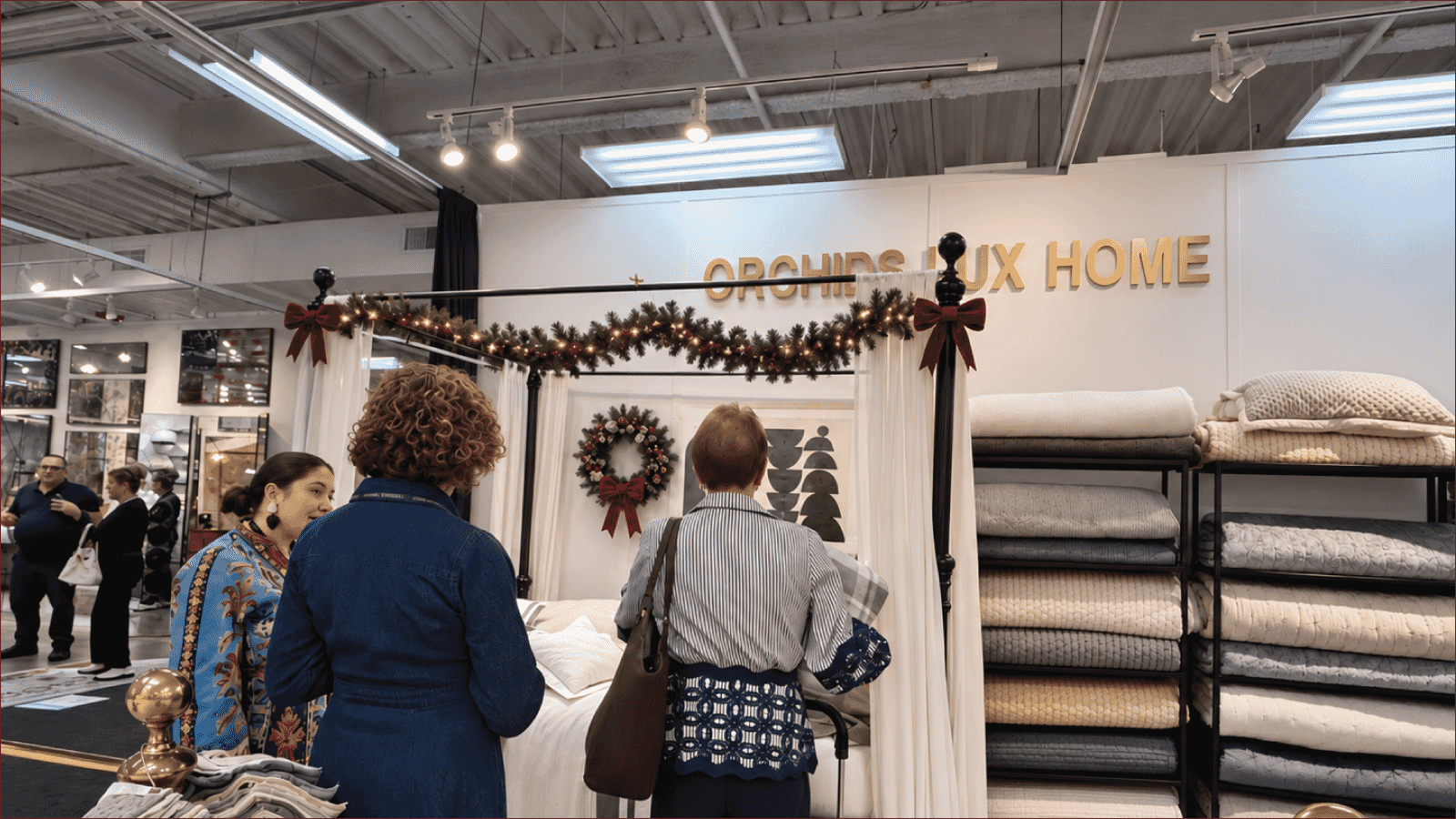
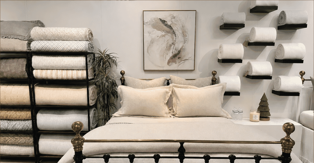
Make your bedding display easy to explore by giving each fixture a clear role. Use shelves at different heights to show folded Coverlets and Quilts, with enough of each piece visible to reveal its color and pattern. Keep heavier items on lower shelves and everyday options within comfortable reach.
Place extra Blankets in baskets beside the display bed, without packing them so tightly that shoppers struggle to remove one. Movable racks can hold coordinating pieces and make it easier to refresh a holiday grouping as stock changes.
Leave clear space between fixtures so customers can step back, compare options, and browse comfortably.
Arrange Displays for Easy Browsing
Make your bedding display easy to explore by giving each fixture a clear role. Use shelves at different heights to show folded Coverlets and Quilts, with enough of each piece visible to reveal its color and pattern. Keep heavier items on lower shelves and everyday options within comfortable reach.
Place extra Blankets in baskets beside the display bed, without packing them so tightly that shoppers struggle to remove one. Movable racks can hold coordinating pieces and make it easier to refresh a holiday grouping as stock changes.
Leave clear space between fixtures so customers can step back, compare options, and browse comfortably.
Conclusion
With your holiday palette, textures, and display plan in mind, it’s time to choose the pieces that bring them together. Explore Orchids Lux Home’s collection of Sheets, Duvet Covers, Quilts, Coverlets, and Shams to build inviting showroom displays and thoughtful client selections that feel seasonal and remain relevant beyond the holidays.
FAQs
How can bedding feel festive without Christmas prints?
Use a seasonal color combination and introduce contrast through quilting, velvet, or woven fabrics. The bedding can establish the holiday mood.
Which colors work well for Thanksgiving bedding?
Olive, dune, flax, caramel, and warm neutrals offer useful starting points. Choose two or three shades that suit the existing room.
Can I mix colors from different palettes?
Yes. Choose one main shade, a supporting color, and a smaller accent to keep the combination clear.
How many textures should a display include?
Start with two or three distinct surfaces, such as smooth cotton, quilting, and velvet. Add another only if it contributes something different.
How can a holiday display work beyond December?
Keep versatile colors as the foundation and change smaller accents. This lets you refresh the presentation without replacing the full bedding selection.